BLOGGER TEMPLATES - TWITTER BACKGROUNDS »

V&A Visit

This is my visit to the V&A Power of Making, which I have to say by starting it off as even though we didn't get as much time as we wanted we strolled around the area looking at these beautiful pieces, that were outstand and creative. As you can see the photos below are off the internet because we wasn't allowed to take photos which I'm pretty sure it was to do with copyrights. the atmosphere in the room was facsinating because the people that would come in the room such as myself was just amazed on how these artists made these pieces and yet how much time it would take them and also involving skill. my overall review about the V&A Power of Making was it was wonderful to see these creative pieces and that it would be a challenge to make a response.


This is piece is by Gary Hutchins, this piece is called six-necked guitar. When I saw this piece I thought it was amazing because I've seen a Three-necked guitar but never in my life seen this. I think it's creative because you can't physically hold it but to just show it can be made is a mysterally feeling to actually play it.


This work is called Crochetdermy bear it was made by Shauna Richardson. when I first saw this I thought it was different because most things in the V&A Power of Making area were mostly about human things and yet this work stood out from the rest because it was something different within the theme 


Blond Lips, Charlie Le Mindu using Hairdreams. Image by Manu Valcarce. when I saw this I thought of a music artist called Lady Gaga because she comes up with these outrageous designs , but other than that I really looks good because it's eye catching and creative and it makes you think could someone have their hair like that someday? 

final window Project

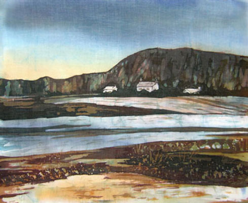
As you can see this is my planning of what is going to happen in the window and what it's going to look like and also what artist that I'm responding to.


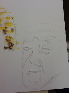
As you can see this I started with the drawing of my brother in which this photo was taken on my holiday to Italy. In this photo I drew the estimate size I wanted to draw and so after when I finished doing that I very neatly followed the lines that I needed to cut out and it worked when I finished it.                              
                  

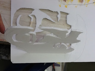
In this photo you can see what I was working with which was the polyboard and in my head I drew it out perfectly and so I continued...
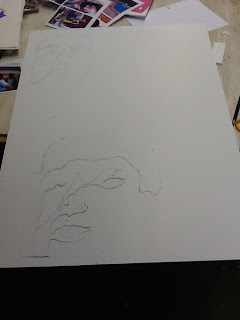
This is a drawing of me that I took from the holiday photos and as you can see I turned it into a stencil as I did for every drawing that I did for the project and so I did the following of drawing and cutting the lines.
This is a close up from the completed view of the cut out shape 

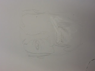
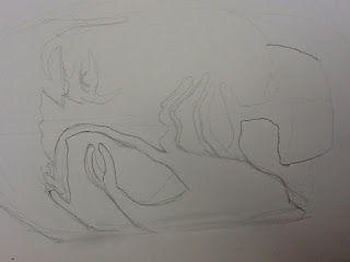
 This is a drawing of my brother which it was hard to do because there were so many lines and in this photo you can see my rubbing out in which I corrected afterwards
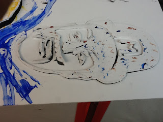
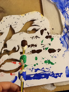
When I finished all of the cutting from the drawings, I started to paint the polyboard with the experimental mark making techniques that I learnt and as you can see I used a PVA glue brush which I found it hard to use because it's so flat meaning that the paint dries out with one swipe

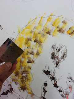
In this photo as you can see I used a sponge to make a patten-like feature towards the mark making technique and just like child's play it was easy to use because all I had to do was dip it in the paint and dip it as much as I can on the Polyboard 

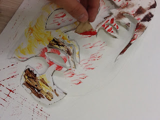
Yet again I used the sponge because it was an object that can be used multiple times meaning putting different colours on each corner and in this photo you can see that I used it on my cut out drawing. In the photo below you can see the completed version 

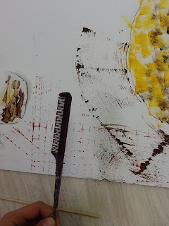
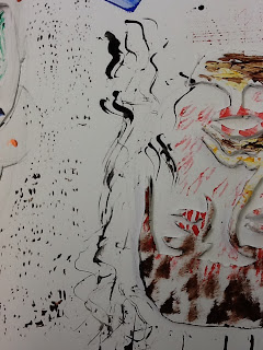
In this photo it shows another object that we use in our every day lives to prevent this feature of a comb being used in a swift motion which you can see from the paint. I painted with the comb for the background which became handy because instead of doing a swift motion I did a pattern motion which you can see from the photo having red little boxes. in the photo below you can see the red pattern even more                                                


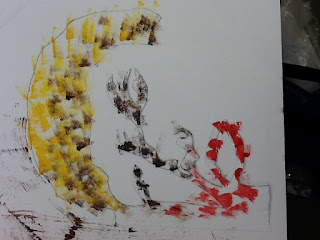
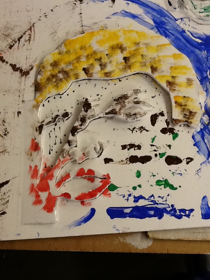
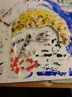
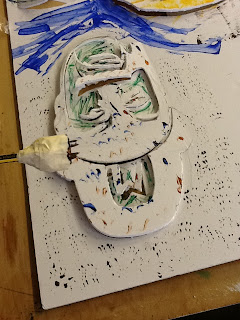
This photo shows the completed version of my little brother that I drew and cut out.

in this photo it shows that I used a piece of cardboard to create the shape that is on the polyboard which I was meant to do it for the lips then i got carried away ... 

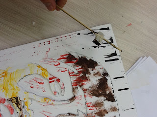
 As again I mix things up to create different patterns for example in this photo as you can see I used a stick 

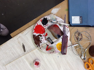
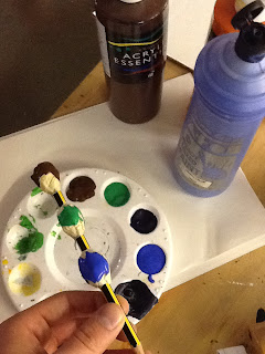
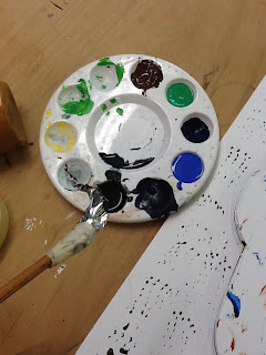
In this photo I took a picture of the objects that I used to paint my drawings 

This is a drawing of my dad in a stencil because then it allows me to cut it out easy and it worked 


This is a photo of proof that it works from the drawing of my dad


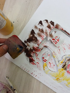
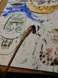
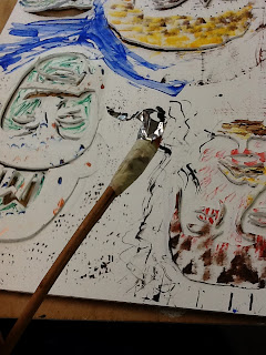
As you can see I used the end of the scissors to paint with and as you can see what I done was that I used two different colours such as red and blue, I found this technique hard to do because the pain will build up as i swipe giving that fating look.
In this photo you can see that I completed the painting part of Marco's cut out 
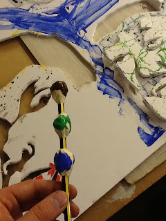
As you can see I made something up again and as you can see it's a pencil with three ball like masking tape around it, which was handy because it allowed me to create a nice pattern with three different colours.


This is a photo of before my project wasn't painted with this object 


This is what it looked like after because I did an over layered method which as you can see I started at the bottom then moved up and as you know it will catch the other paint that was layered before, which as you can see on the work it starts to mix 


this photo is the finished version of the painting of the object that I made with a pencil and some masking tape. In this photo the paint makes the actual cut out drawing look more difficult to figure out what it is 

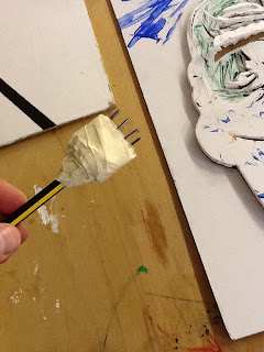
this is another thing that I made, with some masking tape and nails and a pencil, it does look scary but it's completely harmless because in the process of painting with this it was actually hard because I didn't tape it well, which means that every time I dipped it into paint the nails would move in meaning it'll give me a different stroke to what I wanted in the first place and also when I pressed down to make those patterns ( in the photo below) it'll sink in the masking tape. 

Even though its upside down you can still see what the finial painting with that object actually turned out and I must say it turned out good because its just a nice repeated pattern around the cut out piece.

This is another object that I made up, it's a stick with a chocolate wrapper on it. The process of using this was really easy because it was so loose and the paint would go everywhere as I stroked it on the paper, as you can see that the outcome of this object turned out to be a random affect because you can see that at the top there's a thick yet bold paint then it starts to fade and become thin and as I turned the stick each time I dipped it into the paint it gave me another affect on the stroke. 


This is what I was on about when I was talking about it would give me a different affect on each time I turned the stick when I dipped it into the paint, this was the other side of the wrapper and that side gave me the thin and faded affect on the stroke 

 This is just a photo of me using the object in the process painting 

As you can see this is a photo of the stick wrapper brush I made  and this is the final painting up close  

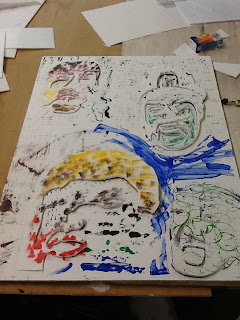
I couldn't get a good photo of the final piece, but yes as you can see I used the artist of Peter Callesen due to the inspiration of making the heads of my brothers and dad into an art form of what Peter Callesen does and also the Experimental Mark Making which I learn from the workshop and as you can see I found it fun and exciting. 


Sarah Tucker experimenting with painting techniques

Sarah Tucker

Sarah has been developing and experimenting with wax resist techniques for many years, producing a wide body of work transformation of k:
Loch DromaTidal Flow'My aim is the colour perception resulting from the endless variations of the batik process. I work on cotton lawn, silk and Chinese hand-made papers. I sometimes use a canting,(a traditional batik tool - a wooden handle with a small metal cup with spout out of which the wax seeps) but often prefer to work with brushes and other techniques to apply the wax - the simpler the better. I also hand-paint dyes, but dip-dyeing remains crucial to my work; the colours are constantly changed, muted and transformed by the immediacy of the dye bath. I particularly enjoy the marbling effect created as the dye penetrates cracks in the wax. Batik for me means colour and change.'
            Sarah has run regular courses on batik for, amongst others, Morley College Lambeth, West Dean College Chichester and Hackney Community College. She has taught practical classes at Art In Action Waterperry, Oxford for a number of years.


This is an artist who creates wax resist paintings and as you can see it's really come together due to the first picture, showing the detail of the rocks which they standout because of the crayon. you can clearly see that she's painted the sea more with the water paints and given us some crayon detail. to me for this painting, everything stands out and I think that the point of wax resist paintings is to capture the little things with more detail to make them standout other than the bigger things.

first impressions
my first impressions about this artist's work was that it was amazing how she worked with the two different types of art material and made it into something beautiful

what materials and processes have been used
In this picture above I can see the water paint is used as the sky and the water mostly yet its used again for the sand near the stones, the crayon is used for the mountains and the stones to give it a more rough look. There are many different colours in this picture such as blue, brown, green beige and so on.

Background information
the name of the artist who made this piece is called Sarah Trucker  and the title of this work is tidal wave (The bottom picture) I am guessing from the website that Sarah Trucker produced this work in the year 2010 http://www.sarahmtucker.co.uk/tidalflow.html other than that it doesn't have any information

meaning
I think that the picture is about peace on mother earth because this work really shows me that everything can be quiet if we let nature do its part because all you see is what the earth has created and there's nothing manmade in the picture. what mood I get from this work is that it just makes me calm and would want to produce something like this by going out there and do it, so really a motivation.

what do you think of it
when i look at this work I can Imagine that I can hear the tide going in and out, taste the sea water through the air, smell the dirty mud and the sea water together and also feel the wind go passed me, with little drops of the sea water sliding across my face as the wave clashes with the sand and the rocks
This is experiment for the wax resist technique. I found it hard to work with because I don't usually do this on a regular basis and so i thought the outcome was really good because the crayon and the water paint really mix well with each other 


as you can see me working on one of the wax resist techniques paint, by using the green crayon drawing the outline of the flower then using the water paint to create the tone and colour of the flower into my wax resist and as you can see it's really starting to work, the crayon and the water paint begin to work with each other


mono prints

These are my Mono Prints that I made, by using acrylic paint and objects that we could use other than a random object. the things that I used was my fingers and a pencil. I thought this process was interesting yet hard because you'd have to get the right amount of acrylic paint on the board so, that it will come out clear, for example the face in the middle shows it being clear and also by using the pencil really does give it detail to what it originally was
this design was used by my holiday photo drawing that I drew from the holiday photos and so I think it's a great development because it's been through different materials and types of art


the yellow paint of this mono print wasn't finished but as you can slightly see there's an eye and the wringles and a line forming the nose, this was meant to be a drawing of a monkey that I drew on the aeroplane whilst going to Italy.

Sue Mayo LIFT Project artist analysis

Sue Mayo

Sue is the leading artist of the project.
since 2008 she has been working on the LIFT Living Archive by exploring ways of bringing  the educational and community groups to life, other than being the head of the LIFT, Sue is also theatre maker and community artist and has been working for 30 years and continuing. As she gets in different art forms she decides that the community groups should go off and create their own work, in ways to get things done and faster, the different art forms means writing, performance, visual practice or site-specific work, she is Associate Artist for Magic Me, the UK’s leading inter-generational arts organization and Associate tutor on the MA in Applied Drama at Goldsmith’s, University of london
http://www.magicme.co.uk/

Cliche Verre Process and Response

As you can see in this photo the Cliche Verre process  shows that it's basically a way of creating a negative by hand, this process begins in a normal room drawing a person or anything onto Acetate then after go into the darkroom and use the machines that are required to process this element, meaning you'd have to use a special paper to place under the acetate drawing then to turn off and on the light switch of the machine because it's aiming down at the acetate and special paper, meaning that the image from the Acetate will give a negative affect on the special paper because of the black lines from the acetate drawing leaves white lines instead of black. after that the special paper would have to be dipped into three trays for a certain amount of different times in each one and in each tray it has a Developer, Fixer and water. The Cliche Verre Process was the earliest form of reproducing imeafes before the advention of the camera, so this process of reproducing images  has been used from a long time and it's still been used today.


the photos below shows the responses that I've made from my photos from my holiday to my drawings about the holiday. as you can see I drew my cousin Elio from the photo he took with the ipad 2, I drew the same photo out in my book in different materials and so I drew it on the acetate with a
permanent marker and by making the cliche verre process I used the dark room and the machines to process it

as you can see these are the first drawings of the photos on acetate with the permanent marker of  my cousin Elio 

I had it scanned in and printed out on acetate so that I can use it on the machines in the dark room because it's a safer way to keep the drawings due to any accidents that might occur  

in this frame I had a piece of card board and I covered the photo so that when the timer of the light stopped shining down on it, it would leave a mark, which as you can see I started from the bottom of the photo and worked my way up, leaving the plain white bar which you can see that the black bar is the least amount of time that the light has shined on.
another experiment that I did, by using the machine but leaving it for a good 10 seconds which as you can see it brings out the moment of me processing the drawing because of the scribbled marks of the drawing
same thing again but this time I gather all of the drawing and did it as one piece, which as again it really brings out the process of me drawing it